Category Archives: Technical

The whole process of making “ΔS”>> (part 2/2)

So, as I mentioned in the previous part, this post will be about background work.
Again, this is not a tutorial – just my personal way to work. (Though some parts make the text sound like an advice, those are just my opinions. I do stand behind them, but I’m not saying they are the “right” way to do these things.)

I rely on a few Japanese terms in this post, and I would like to give an excu…explanation for it here: I use Japanese way more than English nowadays, so the words often occur to me in Japanese first – and sometimes they don’t even seem to have English counterparts (or even Finnish for that matter… in some cases corresponding terms just do not seem to exist), which makes writing this kind of blogs post a bit challenging, since I can’t make myself not to use a convenient word when there is one. If you have suggestions for English translations of the words appearing in the post below, I’d be happy to hear them.

The background work is divided (somewhat artificially) into three main categories here: (1) studying, (2) obtaining references and (3) making materials.

1. Studying

For the most part, this could also be described as taking notes. Below is a list of the typical characteristics and the types of these notes.

  • Almost all practices and notes I draw nowadays could be described as “aimaimosha” (曖昧模写, i.e. drawing what you see but with your own drawing style).
  • I usually choose a particular topic (e.g. having a cat on your shoulder), make an image search with it on Google and draw several of the photos that were found.
  • Starting from a few months ago, I’ve recently practiced drawing nude models every now and then (here, in case you’re interested in giving it a try yourself), which I should’ve started doing it a lot earlier since it’s quite educating.
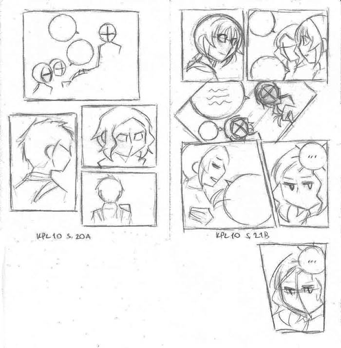
  • Other than that, I have also been making notes about manga page layouts I’m fond of. (In practice I’ve drawn a draft-like version of the page and then analyzed why I like it and why it works for the scene in case.)
  • Some years ago I browsed through TV tropes taking notes along the way XD (… I wonder how many others have regarded reading the wiki as “studying”. (Sounds more like a convenient excuse for spending time there. Nevertheless, I think I actually gained a lot of useful story-making-related information and perspective reading the articles.))
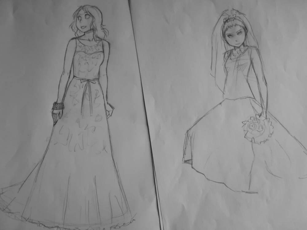
Wedding dresses~

Throwing in another Japanese term: “hikidashi” (引き出し, “variety of knowledge and experience useful for handling things impromptu” as translated on jisho.org) is something I aim at continuously expanding. There are two reasons for this: First, you can draw much faster if you’ve already accumulated knowledge on how to draw certain things (say, how a particular kind of cloth folds when the person wearing it bends his hand), as you don’t need to rely on references for those parts. Second, seeing lots of things you (a) want to learn to draw, as well as (b) other people’s written and drawn works, and subsequently analyzing them (in case of things you want to be able to draw: making observations on what kind of “rules” there are for drawing them; and for other’s works: what you like in them and why) makes it easier for you to come up with your own ideas in the long run. Ideas never occur to people from nothingness after all; much like you cannot design a house without having previously seen lots of various houses and other buildings. In other words, you need to have previous information and knowledge to work on.

To wrap up: seeing and studying a lot helps you to get a gist of the essential part of the subject at hand, which in turn enables you to develop your own original ideas on it.

2. Reference materials: searching, designing, making

2.1 Searching

I choose a topic I’m either going to include in a future drawing (or a panel of the comic) or that I just want to draw. After that I make an image search on Google and draw some of the search results – the ones that I can learn something from or that simply look nice to draw. From time to time I scan these practices, after which I sort them into relevant folders (often subfolders of subfolders of subfolders…) where I can later find them if needed for referencing or revising. I like to keep things in order (people having seen my room may refrain from sarcastic comments – it might not look like it, but is in order… -_-; …from my point of view), because otherwise I will be at loss what to do next.

About year and a half ago I bought a figure (“Bandai Tamashii Nations Woman DX ‘S.H Figuarts’ Action Figure”), a purchase I haven’t regretted. (Upon rereading this text, the previous sentence sounds a way too commercial-ish. But I leave it as it is.) The figure doesn’t have the same proportions than any of the characters of the webcomic, but it has been really useful when drawing particular pose from a particular angle. Definitely recommend that or something similar. (The one I bought from Amazon UK was a bit over 80 euros at the time.)

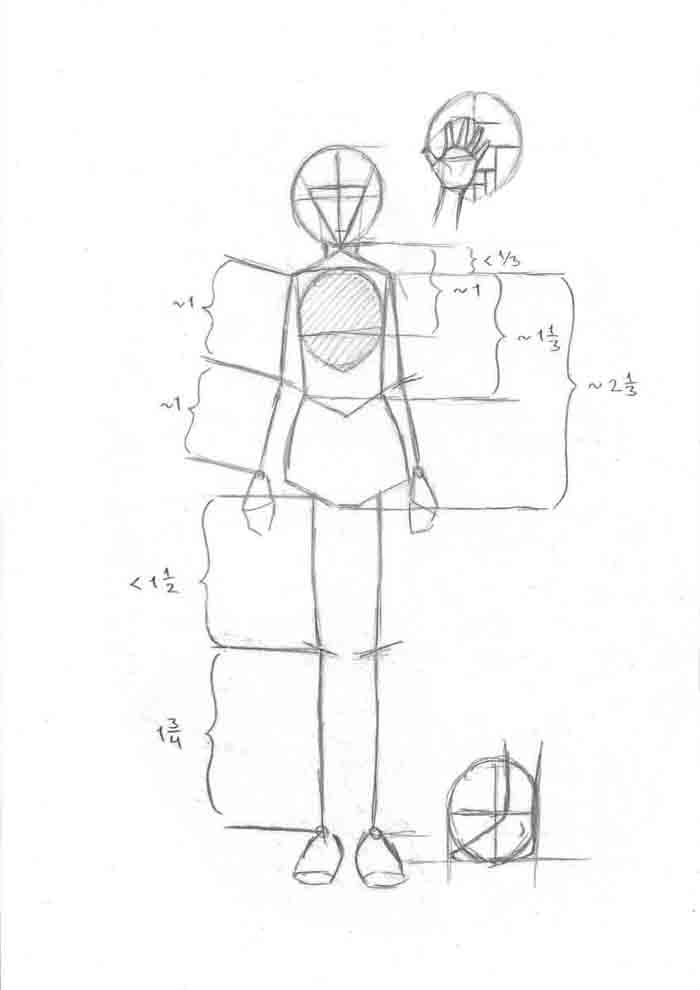
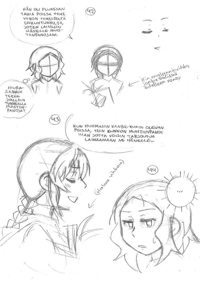
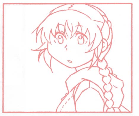
To combine the figure’s pose and the proportions of a particular character, I make use of notes like this. (The one in the image is Hiura’s.)

I also take photos of myself for reference. It’s a good method for pose + outfit (I try to wear something at least remotely resembling the clothes of the character) combinations, but cannot be used for upward/downward angles, running etc. – at least not without an assistant taking the photos for you.

2.2 Designing

This resembles writing the plot. When I hit on an idea of a character, character’s clothes, building etc. I write (or rather, draw) it down. Unlike with plot however, I sometimes need to go and search for ideas – especially when it comes to clothes. Again, image search on the web is a handy tool.

2.3 Making

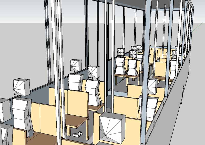
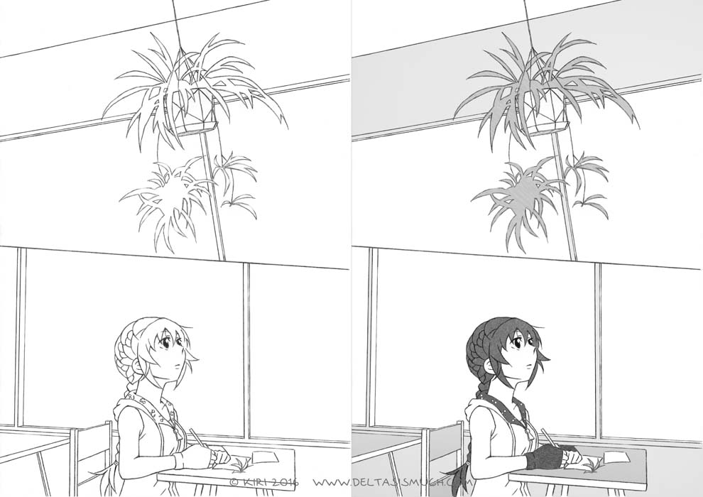
Some years ago I made a figure’s head from clay. It has been marginally useful. I also made miniature classrooms (with desks, chairs and rather simplified characters – height, width, depth being calculated and corresponding to those in the webcomic) and a part of a suburb, and… they surely took lots of time to make. Which is the main reason why I still can’t make myself throw them away. Though I don’t use them anymore now that I’ve got to know to SketchUp. (The clay model I still use in rare instances.)

So yeah, SketchUp. Having a history of making models from paper, this software has been a real treasure: you can create rather detailed models with the exact dimensions you want (quite elaborated ones even, if you’re adept – I’m not), and after making a, say, desk, you can easily copy it to fill a whole classroom… No need to measure the dimensions with a ruler, cut the paper, bend it and attach it with a paper clip again and again with every single desk… (Thank you modern technology…) And it’s quite cool to see the buildings and rooms you’ve designed existing as 3D models.

One of my ongoing projects is to draw comprehensive enough collection of references of the “ΔS”>> characters. I want to keep the drawing style consistent (which it hasn’t been), and as I’m also somewhat obsessive about the heights of the characters (especially about how they relate to each other when characters are in the same panel), references are a must. Unlike with buildings, though, I’m fine with paper in this matter 😀 Paper, pencil, previous notes, calculator and ruler, to be exact. No need for (read: not enough knowledge or enthusiasm for) building 3D models of them.
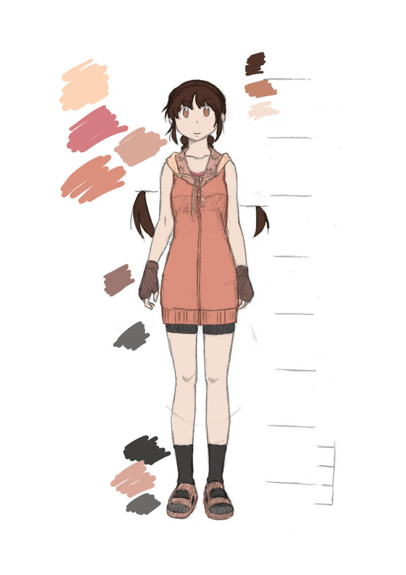
A color scheme

Actually, I have built 3D models of characters too (the quality being on the level I can reach with my current SketchUp skills), in order to be able to place them inside the 3D models of rooms, buses etc.

3. Making materials

By materials I mean things that are used in the comic as such, i.e. textures and fonts.

  • I take a lot of photos, some of which use as textures in the comic. Before using the photos I usually adjust contrasts, brightness and levels to modify them for use. Sometimes I combine two photos by putting one over another, after which I make the upper one more transparent or change the layer’s state to “multiply”. And, as with references, I try to keep these files in order by sorting them into relevant subfolders.
  • As for fonts, I have made the one used in “ΔS”>>. I wasn’t quite content with it to begin with, so I’m going to replace it with a new one at some point later. The new font is going to resemble the first one, as both are based on my own handwriting. But this time I’ll be using a different approach on creating the font, so hopefully the result will look nicer.

***

All that said, I’m still very much in the process of practicing…

The whole process of making “ΔS”>> (part 1/2)

I won’t have scanner or drawing tablet at hand for a while, so in order to add at least some content to the site I’ll write a blog post. I have written about behind-the-scenes workflow previously too, but unlike in earlier posts this time I will make an attempt at describing the whole process, from start to finish.

I don’t know whether this will be of any value for others as an example (it’s not even the point of this text; my webcomic is pencil-written, processed-photos-instead-of-screentones oddity anyways), but from time to time I get the chance to explain this project/hobby to someone, and… well, as my verbal presentation skills have quite a lot of room for improvement, I usually end up (figuratively) face-palming at my own explanations. But if I put those things on paper here, it helps me to organize my thoughts and thus express them better from now on. Maybe. Also, if I’m lucky, some visitors of the site might actually read this post too.

So, on to the actual topic. The workflow of making this webcomic can be summarized as following steps (listed in a somewhat chronological order):

1. Jotting down ideas

This is something that I always do when I get an idea I may want to use somewhere. And ideas come when they come, usually when you are about to go to sleep or in the middle of taking a walk. (Trying to actively come up with an idea or a solution to something is important too, but the thing you’re trying to figure out (or something completely unrelated but still useful) often comes to mind some time later, when you’re not actively trying to think about it anymore. The brain continues to work on the problem on its own, which is kind of convenient.)

2. Writing the characters and the plot

Characters and plot could be considered their own separate steps – in which case characters would precede the plot, as the latter cannot exist without the former (especially not in a story this character-driven) – but since characters and plot are often so tightly intertwined, I regard them as one single process.

Each one of the character cast of “ΔS”>> has their own image folders and files, as well as a Word file containing various notes. For the main character and deuteragonist I have written short introductory blog posts too.

I’m not sure if I belong the minority or majority on this aspect (the one thing I know for sure is that I’m not the only one thinking this way), but it’s the characters that are making the story move, not me – I’m only an observer trying to find out what happens with this setting, these characters and an outline of a plot. In that sense I’m also a reader of this story myself. And it’s fun. (Which is really the reason I’m making this comic in the first place.)

For me writing the plot is like assembling a jigsaw puzzle (one that doesn’t have a single particular correct outcome) the pieces being the previously jotted-down ideas (scattered in different places on paper notes, text and Word files…), and trying to make sense of it. Might not be the most efficient way to write a story, but at least this way I can make use of the scenes etc. I’ve already come up with and that like, without trying to forcibly come up with something interesting… But on the other hand, making the story cohesive has been causing me a headache a few times XD

3. Planning the layout of the pages

I usually first just think about angles and draw the characters, dialog etc. on an A4 without worrying about the panels or pages.

Chapter 10 spoiler(?) that I previously uploaded on Twitter

When I have accumulated content for worth of a few pages, I start planning the actual layout: I decide what I want to fit into a particular page or spread, and try to figure out how it could be arranged so that it would both look nice and be easy to read. (I do not always succeed in this.)

The panel layout usually looks something like this. The scene is same as in above image.

4. Background work

I’ll return to this part later. The topic is long enough to deserve its own blog post.

5. Drawing the pages

I draw the line drawing with pencil on A4-sized paper, after which I scan the page, and edit it a bit (i.e. clean it up and adjust contrasts).

6. Lettering

Not anything special to mention on this. Only that I use a font made by myself. (I’m – albeit reaaaally slowly – creating a new one to replace it though, as I’m not so content with the current version.)

… And that the lettering used to be quite tedious for Japanese version – what with writing the text and arranging the rows in Word, taking a screenshot and pasting the thing on a page… and repeating the process until the result looked good enough. This was because I couldn’t write vertical Japanese with Photoshop directly. I guess the process might be easier now with Clip Studio Paint.

7. Flatting and adding textures

I have written on the process of flatting here, and on textures here.

***

That’s about it.

Part 2/2 will be about background work, a thing that I omitted in this post and that in fact (at this point anyway) comprises most of the working hours used on creating this webcomic.

On the workflow of the pages of “ΔS”>>

Travelling again. So a blog post instead of webcomic this week. (Please bear with me. ^_^;) In addition I’m finally going to update the Characters page of the website later this week. Look forward to it if you have been annoyed by the “nothing here yet” text.

As some people have suggested me that it could be a good topic for a blog post, I’ll write about the typical workflow of a page of “ΔS”>>. (Only on a general level, though, and focusing on the steps done with computer; otherwise the post would become quite long.)

In short, this post is mostly about flatting (as well as the steps before and after it). It isn’t anything I have come up with by myself, neither is the workflow described below meant to be a tutorial of any kind. (You may regard it as such if you want, but there are other, better tutorials out there. Like this and this one.) This is just a description of how I work.

Without further ado, to the actual blog post:

The general workflow of a page after drawing it

1) Scanning and resizing the page
The original paper size is A4. After scanning it (600 dpi) I change the size to A5.

2) Cleaning up the line drawing; adjusting brightness and levels; lettering

Mode: Grayscale Resolution: 600 dpi Number of layers: Usually one, more while writing text

Mode: Grayscale
Resolution: 600 dpi
Number of layers: Usually one, more while writing text

For lettering I use a font that I made myself. (In the Japanese version, however, I use MS Mincho and occasionally MS Gothic, as well as hand-written text.)

3) Flatting

Mode: RGB Resolution: 300 dpi Number of layers: Usually three (one for colors, one for the line drawings, one for additional lines), sometimes more

Mode: RGB
Resolution: 300 dpi
Number of layers: Usually three (one for colors, one for the line drawings, one for additional lines), sometimes more

The color layer is beneath all the other ones, and the line drawing layer above it is set to “multiply”. It doesn’t really matter what colors are used, as long as they are distinct, since their only function is to make selection of areas easier. (It’s not like I’d ever use that kind of colors for bus interior…)
This step usually takes a lot of time.

4) Colors-only version of the page

Mode: RGB Resolution: 600 dpi Number of layers: One

Mode: RGB
Resolution: 600 dpi
Number of layers: One

5) Adding gray textures

Mode: RGB at first, grayscale at the end Resolution: 600 dpi Number of layers: One initially, several while working, one again at the end

Mode: RGB at first, grayscale at the end
Resolution: 600 dpi
Number of layers: One initially, several while working, one again at the end

Copy-pasting gray textures into the colored surfaces.

6) The final version

Mode: Grayscale Resolution: 600 dpi Number of layers: First two, then one

Mode: Grayscale
Resolution: 600 dpi
Number of layers: First two, then one

Here the line drawing from step 1 is combined with the gray textures from step 4: I start by copying the gray textures layer and placing it beneath the line drawing, after which I set the line drawing layer to multiply. (This is by far the nicest part of the whole working process.) If the page looks ok, I flatten the image into a single layer.

***

Just a random thought that occurred to me a while ago: If there are people who find their way here through search engines, they are most likely looking for something thermodynamics-related information instead of a webcomic that… at this point probably appears to be about falling spider plant plantlets, or something along those lines?  ^_^;  (It isn’t… Or, well, I guess it depends on the way you look at it.)

Screentones (again)

(Though I really should stop calling them screentones before someone gets angry at me for misuse of the term.)

First off, I’m travelling for a while, and since I don’t carry a scanner, light table or graphics tablet with me there will be a longer-than-usual break before the next update of the comic. The following pages will probably be finished and uploaded here by next week’s Sunday (29th of May).

I can, however, write even if I don’t have a scanner at hand, so this time I’ll compose a blog post instead. (Not that I’d think this makes up for the postponed update of the comic.)

grayscale clouds and flowering branches

Flowering brances. Either cherry or apple trees. Not sure. I have taken plenty of photos of both. (I probably should be able to tell them apart by looking at this image, but… Oh well, it doesn’t really matter which ones they are.)

The background of page 5 of the first chapter. Of all the pages I’ve drawn so far, this might be the easiest one to write about. The workflow for it was as follows: (1) designing the layout of the page (already a few years ago); (2) taking lots of photographs of flowering branches and sky (over the years); (3) selecting and cropping a few of the photos (this was somewhat tedious); (4) drawing the page; and (5) adjusting the size, angle and tones of the branches. It took a lot of time to finish the page, but I think it was worth it, as I’m quite content with the final look of the page. (Though it might look a bit odd when placed next to page 6.) Besides, experimenting with different kinds of screentones gray textures is never boring.

This particular file – the background alone – was huge when I was working on it. By huge I mean something close to 100 megabytes. With high resolution, multiple layers and RGB mode, large file size might not be all that surprising, but it did startle me a bit. (I’m quite sure my computer wasn’t too happy about having to deal with an image that large…)

***

Chapter 1, page 6, panel 2

Just a random panel (from chapter 1, page 6). As a filler.

I’m still trying to figure out what to write about in these blog posts. The webcomic is the main content of this site, but in addition to that I’d like to blog something too, every now and then. Technical aspects seem like a relevant subject here, if not interesting, so for now I have settled on them. But variety would be nice too, and I’m open to suggestions: If there is some topic related to this webcomic you would like me to write about (for example some particular part of the working process), let me know. Questions and comments are more than welcome too.

Screentones

So, at this point I have finished and uploaded twelve pages (three of which are either text-only or totally empty, so maybe I shouldn’t actually count them? Well, nine pages) of the story. Not much, admittedly, but more is to come. And who knows, I might also become faster at drawing when I continue this long enough.

Speaking of getting fast, I probably use too much ”screentones” (or rather, gray textures). And because of that, it takes hours to ”color” even a single page. In theory this should not be too difficult a problem to fix, since all it takes is to leave more areas white. But every time I start coloring the page, my hands just won’t stop…   ^_^;

Is it just me or does this page actually look better without any gray textures?

Is it just me or does this page actually look better without any gray textures?